
Selecting the right chart to visualize your data
Choosing the right chart for your data is crucial to ensure that your message is conveyed clearly and accurately to your audience. With a multitude of chart types available, it's essential to match the data's characteristics and the story you want to tell with the appropriate visualization. So, what is the best chart to display your data? Well, it depends. Here are five questions to ask yourself before selecting a chart:
What are you trying to tell with your data?
What is the purpose of the chart?
What story are you trying to tell with your data?
What type of data do you have: is it categorical, numerical, time-based or relational?
Are you comparing values, showing distribution, revealing trends over time, or displaying correlations?
Our go-to charts are bar or column, scatter plots, and line charts. We’ll also use a pie chart every so often to how individual parts contribute to a whole. But we generally avoid using these because it can be difficult to compare actual values.
Comparing categorical information
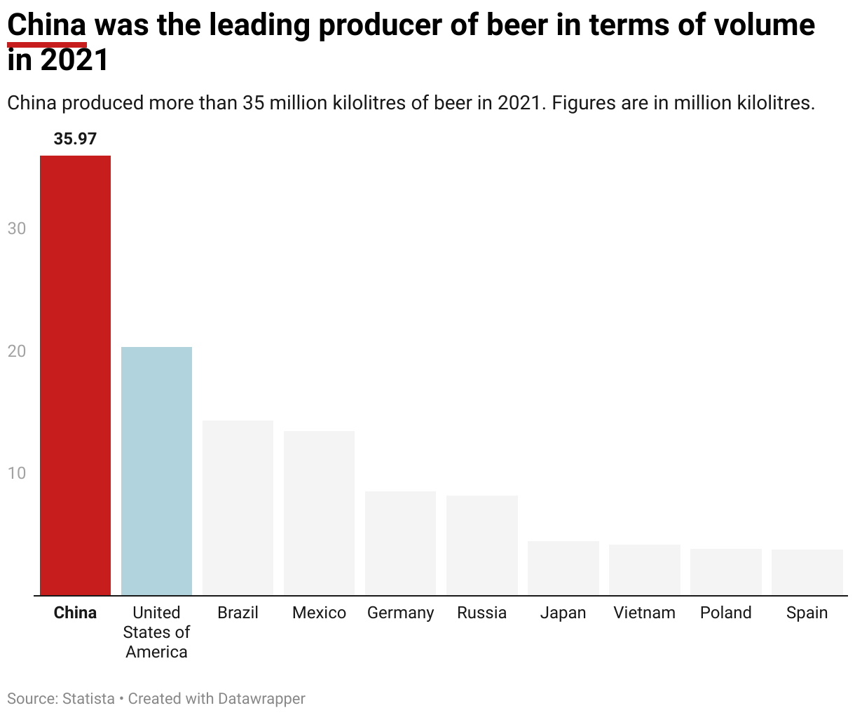
Bar charts and column charts are a great way to compare categorical information and display data in a clear and easy-to-understand manner. They are particularly effective for showcasing the distribution and relationships between different categories or groups. This type of chart consists of rectangular bars that run vertically (column charts) or horizontally (bar charts), where the length of each bar corresponds to the quantity or frequency of the category it represents.
Showing trends and patterns over time
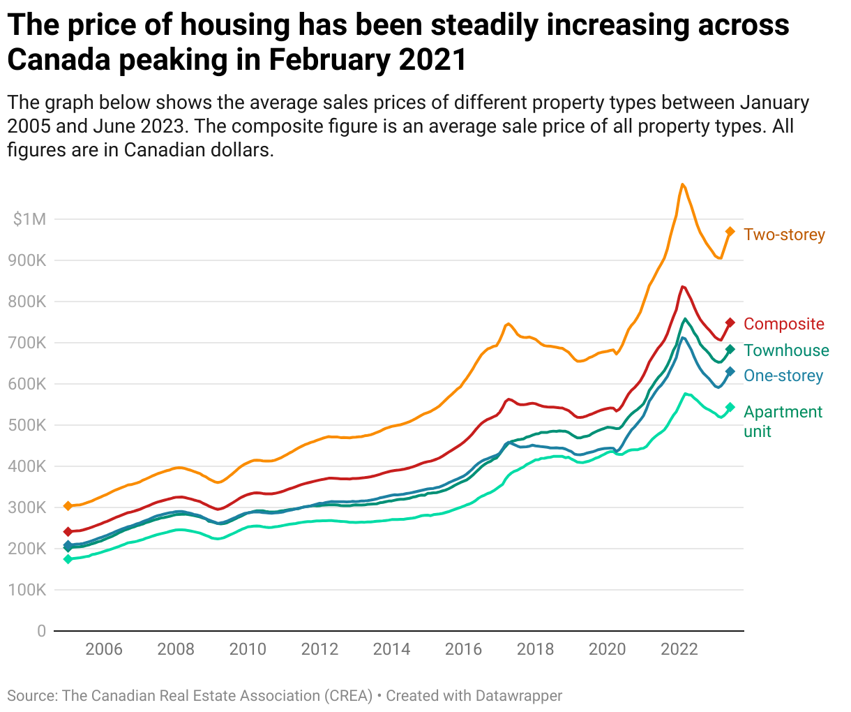
Line graphs are an effective way to show trends, patterns, and relationships within data sets over a continuous period or interval. Line graphs succinctly illustrate how changes in one variable influence another. Their effectiveness lies in their ability to display trends, fluctuations, and shifts in data over time, aiding in the identification of patterns, cycles, and correlations. Line graphs are particularly valuable in fields such as finance, economics, science, and social sciences, where they provide insights into growth rates, historical changes, and comparative analyses.
Showing the relationship between two variables
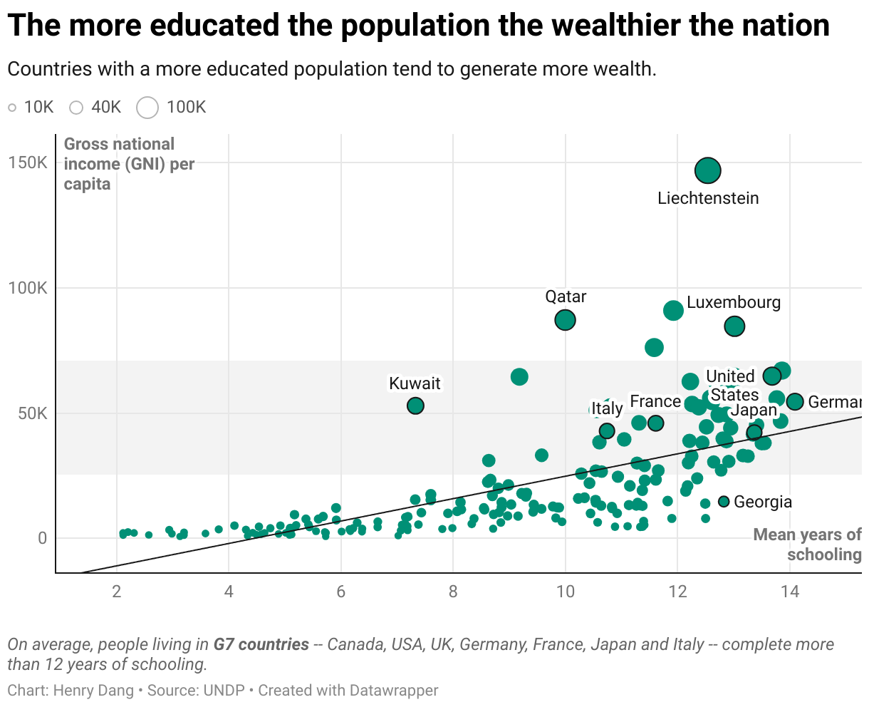
A scatter plot is a graphical representation used to display the relationship between two sets of data variables. It consists of individual data points, each represented by a dot on the graph. The horizontal axis (x-axis) represents one variable, while the vertical axis (y-axis) represents the other variable. Scatter plots are particularly useful for visualizing patterns, trends, and correlations between the two variables. With scatter plots you can quickly identify if there is a relationship between the two variables — positive, negative, or no correlation.
A positive correlation means that as one variable increases, the other tends to increase as well. A negative correlation means that as one variable increases, the other tends to decrease. No correlation indicates that there is no systematic relationship between the variables.
Showing parts of a whole
Pie charts are a simple and visually appealing way to represent proportions within a whole, especially when dealing with a small number of categories and the differences in proportions are significant. However, they should be used with caution, particularly when it comes to accurately representing data values, comparing multiple categories, or conveying complex information. Depending on the context and the type of data, other types of charts, such as bar charts, line charts, or stacked bar charts, might be more suitable alternatives.
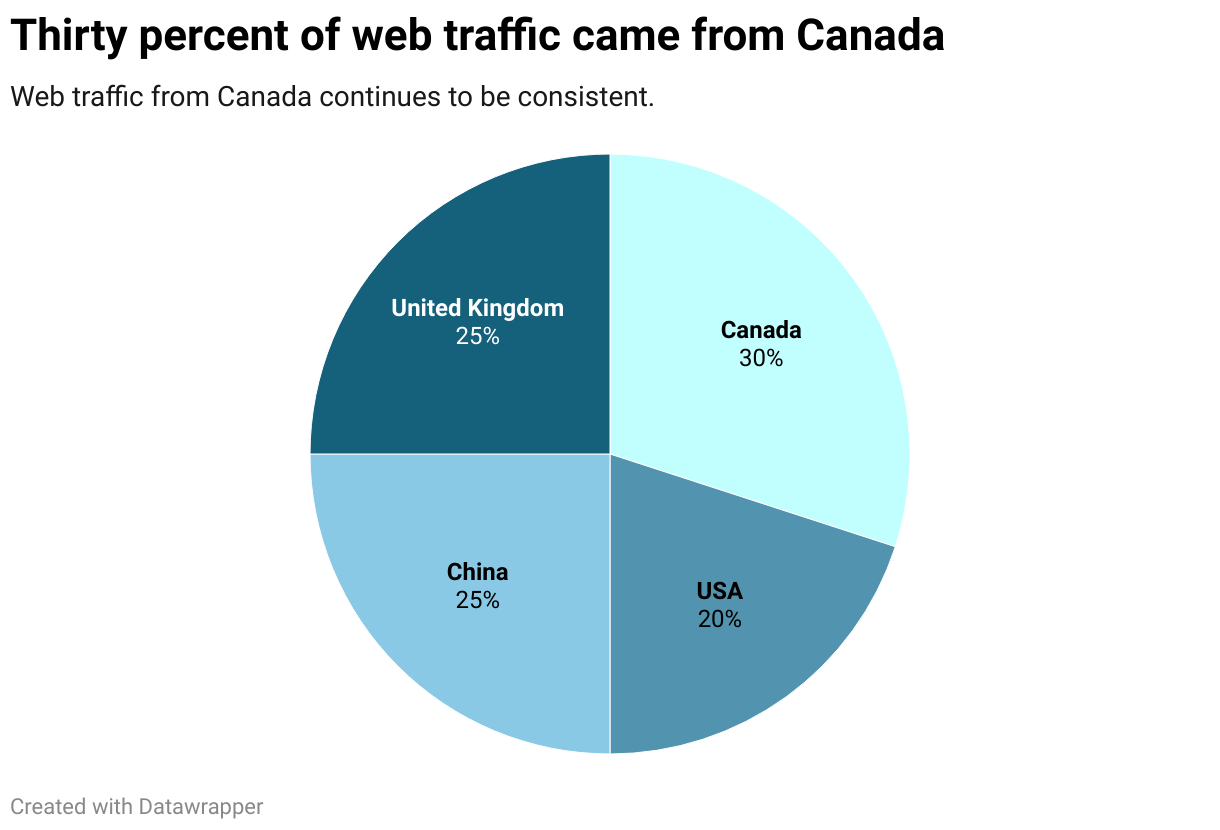
Chart type cheat sheet
We’ve put together this list describing what each type of chart does best.
Bar charts and column charts: Highly effective visualization choices when you want to compare categorical data or showcase changes across discrete categories.
Line Charts: Ideal for illustrating trends and changes over time.
Pie Charts: Use these to show parts of a whole, but avoid them for more than a few categories due to readability issues.
Scatter Plots: Perfect for displaying the relationship between two numerical variables.
Histograms: Depict the distribution and frequency of numerical data.
Area Charts: Similar to line charts but emphasize cumulative data trends over time.
Box Plots: Useful for displaying the distribution and outliers of a dataset.
Heatmaps: Display correlations in a matrix format using color gradients.
Bubble Charts: Combine scatter plots with a third variable represented by the size of the data points.
Choosing the best chart to visualize your data depends on several factors, including the type of data you have, the relationships you want to convey, and the message you want to communicate. The choice of chart should also consider the target audience and the story you want to tell with your data. It's a good practice to experiment with different chart types and see which one effectively communicates your message while maintaining clarity and accuracy. Additionally, consider the visual aesthetics, color choices, and labeling to ensure that your chart is easy to interpret.
You may also like


Finland is the happiest country in the world, according to the latest World Happiness Report. It’s the eighth consecutive year the Nordic country has topped the list. Following Finland are fellow Nordic countries Denmark, Iceland, and Sweden. The Netherlands rounds out the top five.